Centralizing species data
Working with Project Canopy
Overview
Project Canopy's mission is to centralize biodiversity data for the Congo Basin rainforest by providing the analytical tools with which to interpret that data. My goal was to make this knowledge accessible and digestible to donors, governments, and the public at large.
Role
- UX/UI
- Researcher
- Prototyper
Team
- 1 UX Designer
- 4 Data Scientists
- 5 Developers
Timeline
8 weeks
The Challenges
The fact-finding, analytical, and data dissemination processes that drive the formulation of environmental policy in the Congo Basin are fundamentally broken, with far-reaching consequences for the quality and impact of conservation programs. Organizations working on conservation and forestry issues in the Congo Basin face several challenges:
Finding and analyzing the data they need as part of their day-to-day work is labor- and resource-intensive;
There’s a total lack of a platform that systematically communicates the fluctuating state of the rainforest to a global audience.
The Goal
Create a simple, intuitive dashboard that gathers all the data from the IUCN Red List and the CITES Appendices in one place, making it easily digestible for those who need it.
Create Species ID Cards that allow governments, local law enforcement, and anti-poaching groups to easily see all the available information about the different species in the Congo Basin.
The Process
I started by researching the resources currently available and chatting with the client to better understand their userbase.
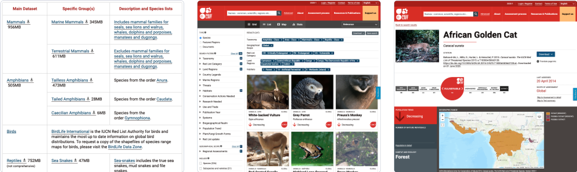
Starting with the IUCN Red List database, I began gathering screenshots of relevant pages. Given the magnitude of information they’re conveying, IUCN’s Red List UI is remarkably easy to use. Project Canopy’s primary demographic is already used to using IUCN’s platform, so while creating PC’s dashboard, I chose not to reinvent the wheel.
Know your users
Project Canopy’s userbase is vast: from high-level policy/decision-makers, to campaigners, to local NGO’s. To narrow down the focus of this project, I focused on two types of users:
Muriel is a program officer at a large international development organization that has decided to allocate $5m to conservation programs for the Congo Basin rainforest.
- She wants to ensure that the programs funded will have the greatest impact.
To answer the questions of where are the highest concentrations of biodiversity and where that biodiversity is threatened, she has to visit IUCN’s Red List and CITES databases to collate, by hand, species information.
Because the data isn’t automatically updated as information changes, the analysis must be re-done every time the organization has a new funding round.

Jules works for a conservation NGO in the Central African Republic.
- He has been tasked with ensuring that local law enforcement agencies and anti-poaching groups are working with the most up-to-date information on which species are threatened and whether their trade is internationally regulated.
- He spends hours combing through the CITES and IUCN databases for the 259 species relevant to his task. He has to construct the report on each species by hand.
- Funding is always tight and this task, while valuable, is extremely labor-intensive. He is the first person to do this in several years.
User flows
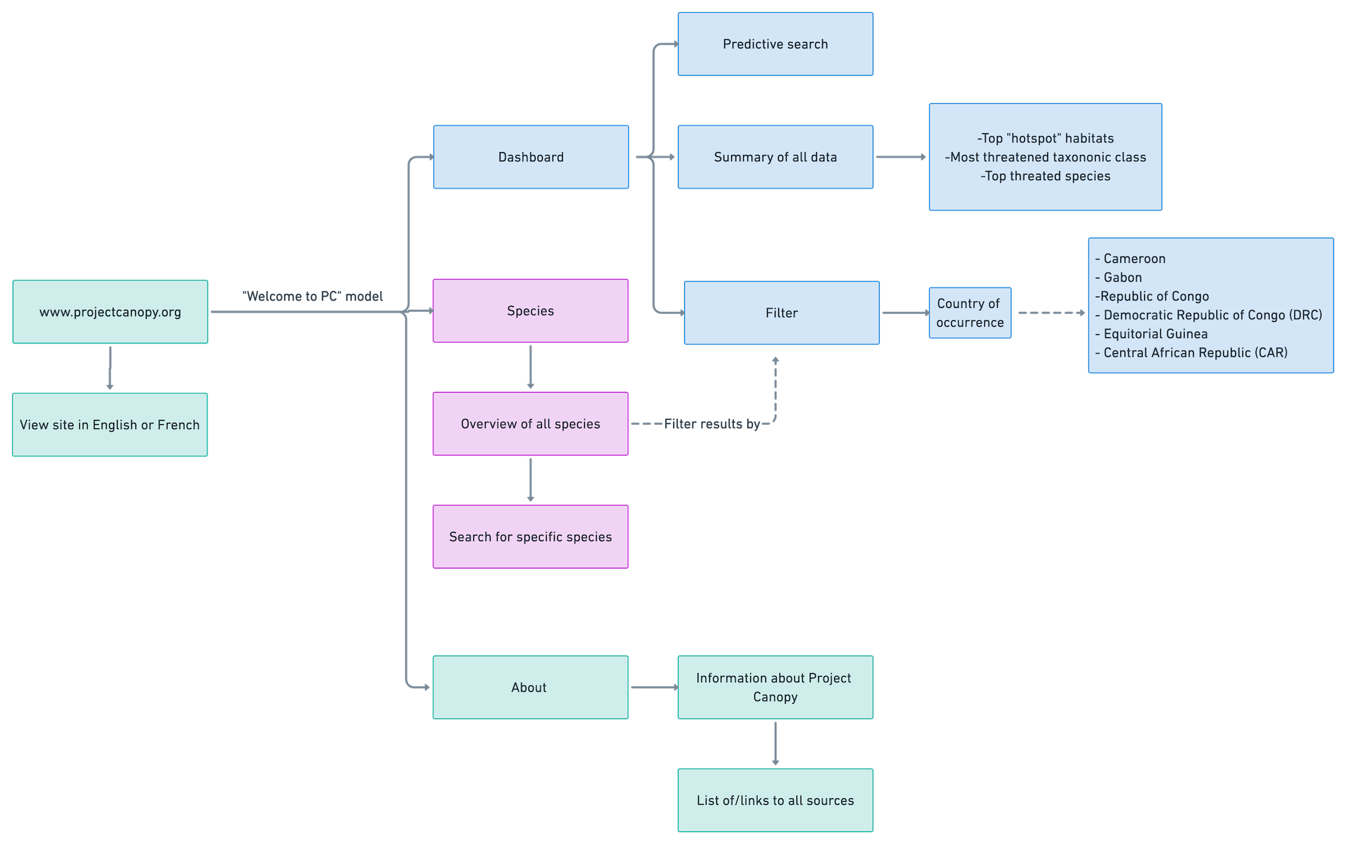
At a basic level,
Project Canopy’s users want to see data about species biodiversity in the Congo Basin rainforest. They need the ability to filter this data by one or multiple countries and view individual species information.
My first user flow was somehow both oversimplified and too detailed (not sure how I managed that). After several iterations that involved wild amounts of detail, I decided that a scaled-down user flow was best for the timeline and scope of this project. User research validated this decision:
Testers liked that they could accomplish their goals without a lot of bells and whistles.
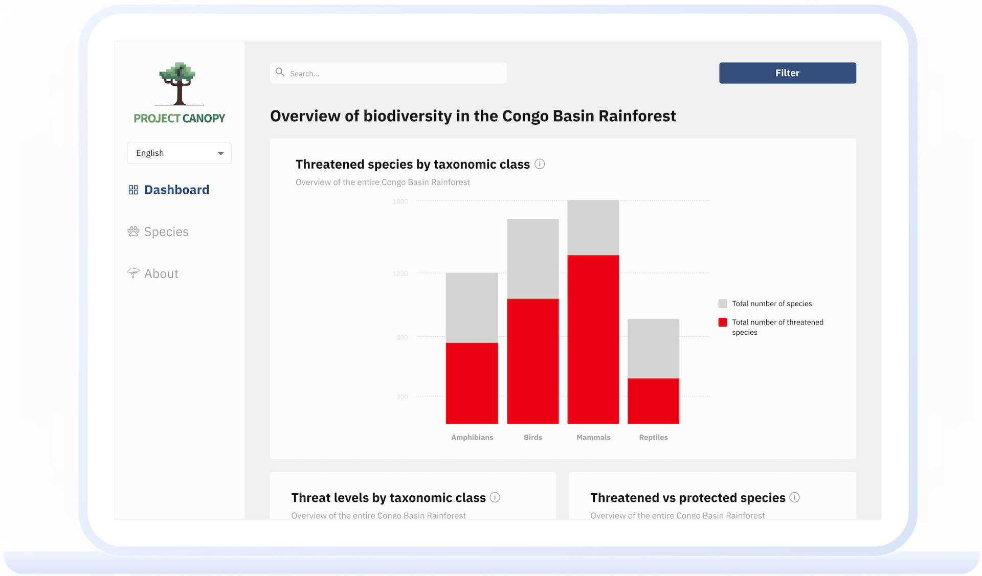
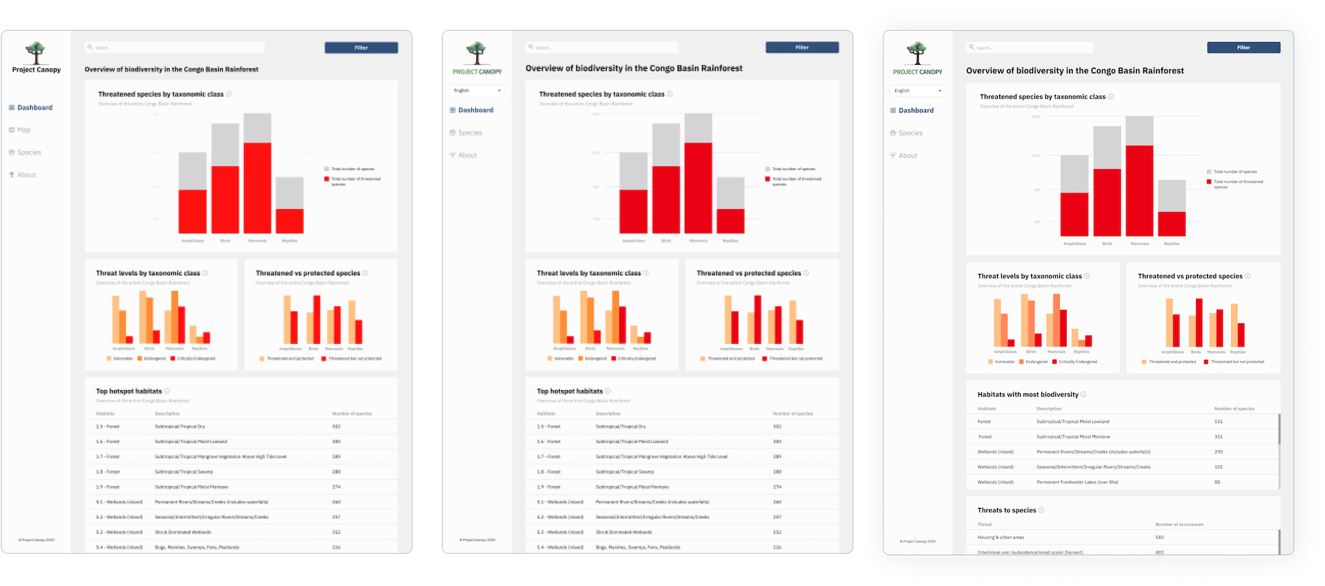
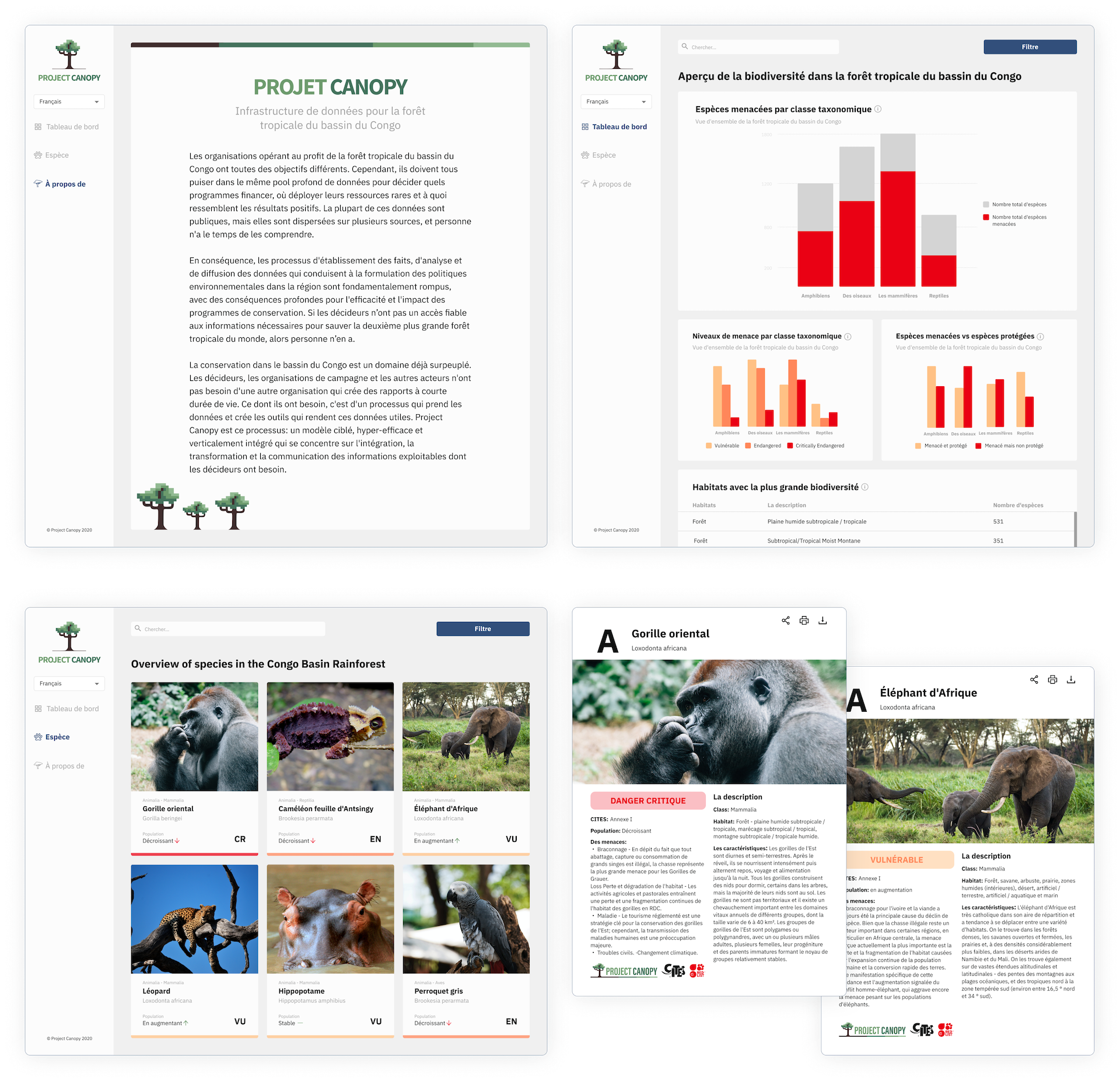
Creating the dashboard
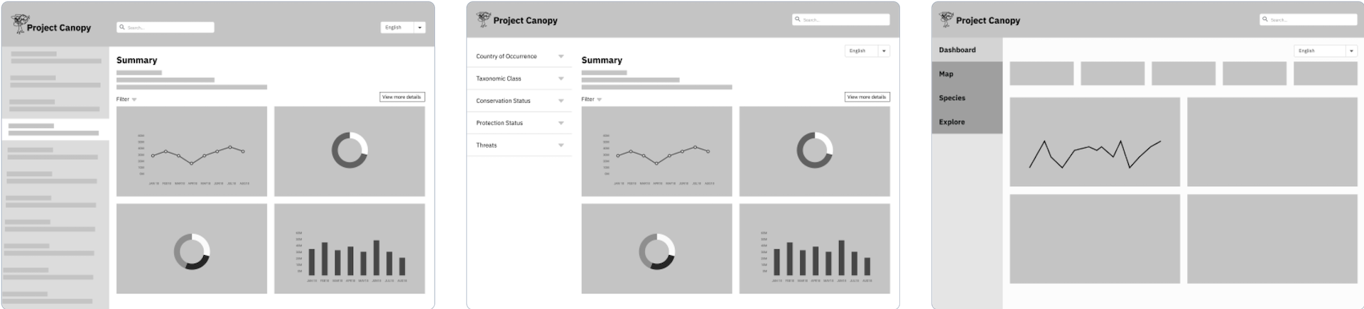
I spent the low-fidelity stage learning about data visualization and exploring dashboard designs. Utilizing the expertise of my design managers and insight from my peers, I landed on a fixed side navigation.
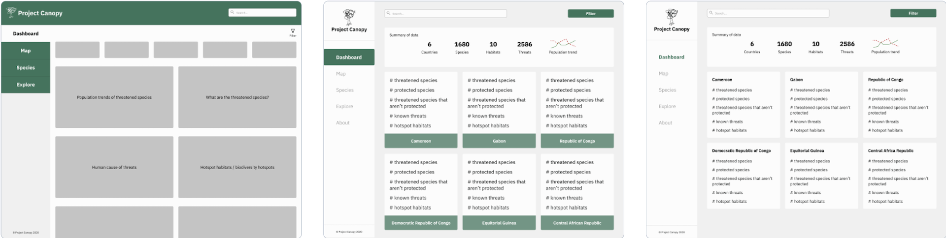
Mid-fidelity is where things really started coming together. I experimented with using cards to see an overview for each country. During design critiques, I received overwhelming feedback that the cards made the dashboard feel chaotic (I whole-heartedly agree!). At this stage, I transitioned away for excessive text and towards graphs and tables.
During a design critique, I received the feedback that my initial color palette did not adequately convey the severity of the information displayed. So back to the drawing board I went!
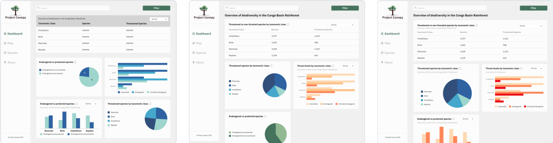
I read more about data visualization and ultimately decided that pie charts weren’t a useful way to display data.
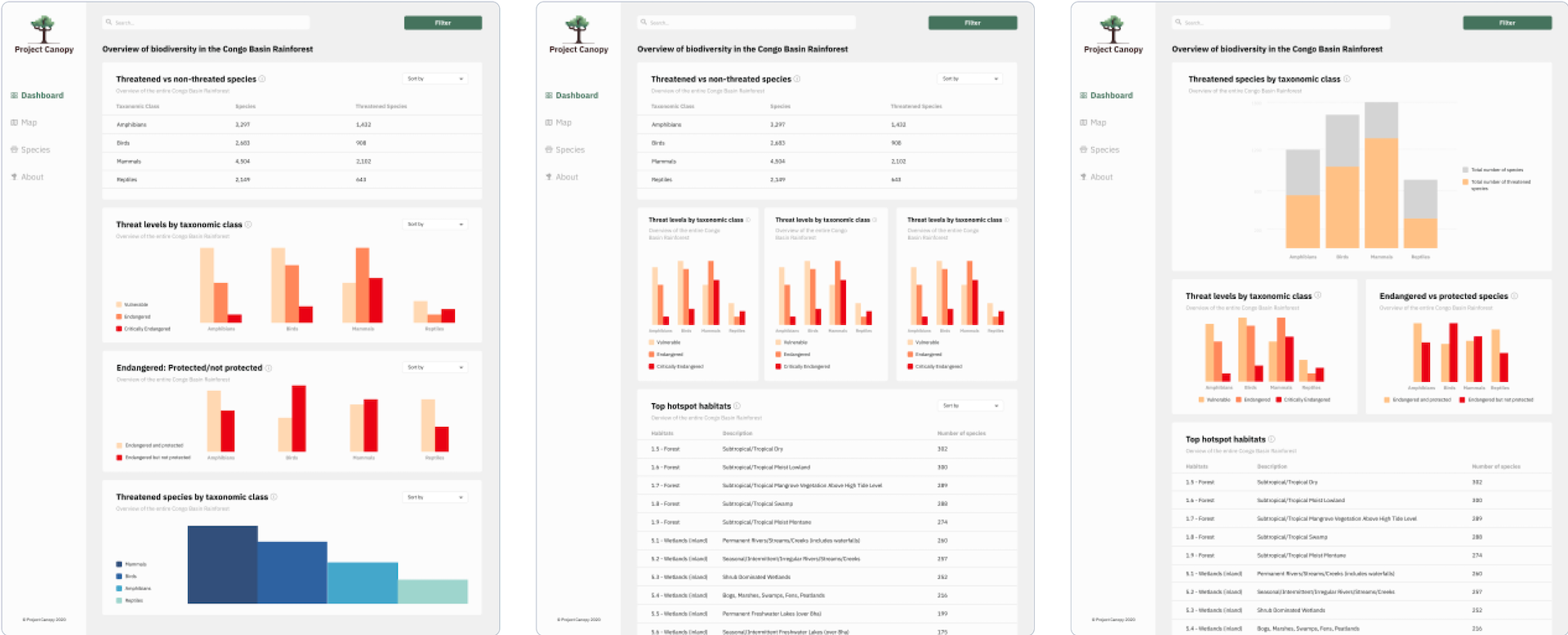
Trying to stay within the client-provided product colors, I tried my hardest to get around the red/green Christmas vibe. Sadly, it was unavoidable. I experimented with multiple tints of red, orange and yellow, and ultimately made the primary button color a dark blue. This allowed me to use the red and oranges needed to convey the severity of the data at hand. User testing confirmed the success of this choice.
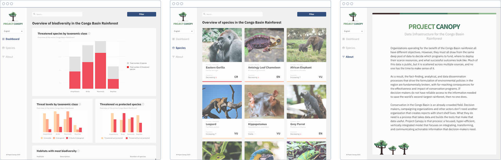
The evolution of the species page
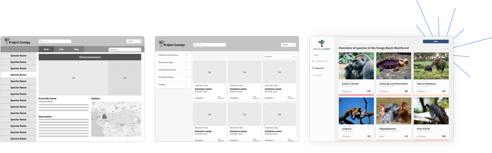
The species page provides a simple and informative view of biodiversity in the Congo Basin Rainforest, while the species ID cards provide more detailed information and can be shared, downloaded, and printed for use by local authorities.
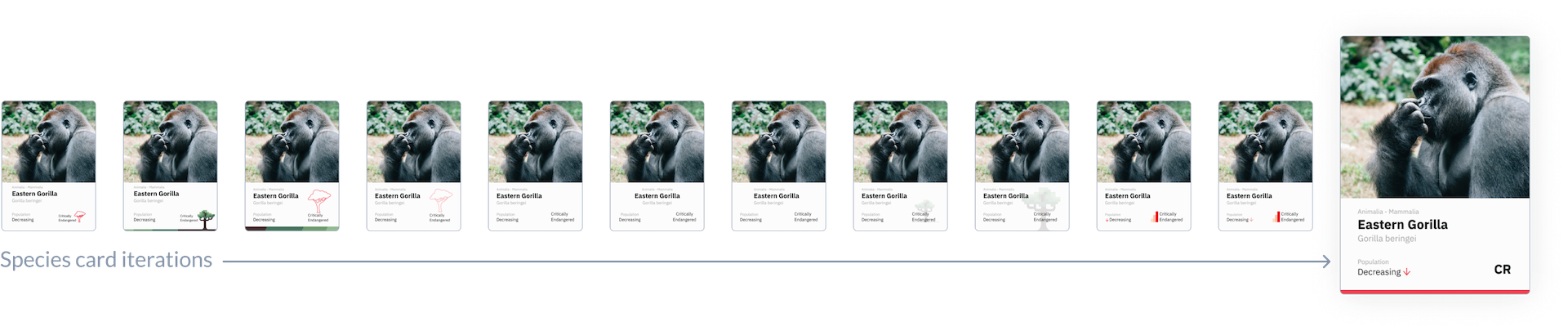
Out of the whole project, I had the most fun designing the species cards. They’re like baseball cards, but for animals! My goal was to keep them visually simple while still conveying the most important information.
Design system
Color palette
Project Canopy’s original colors were very warm, so with the blessing of the clients, I adjusted the tone to cooler variations. I wanted to keep the same earthy vibe, but elevate it to feel more modern and sophisticated.
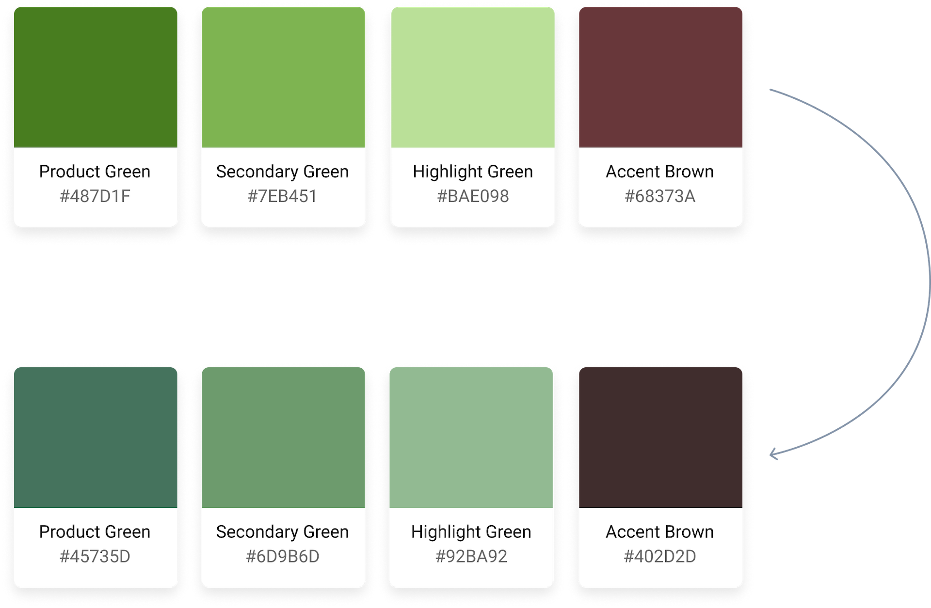
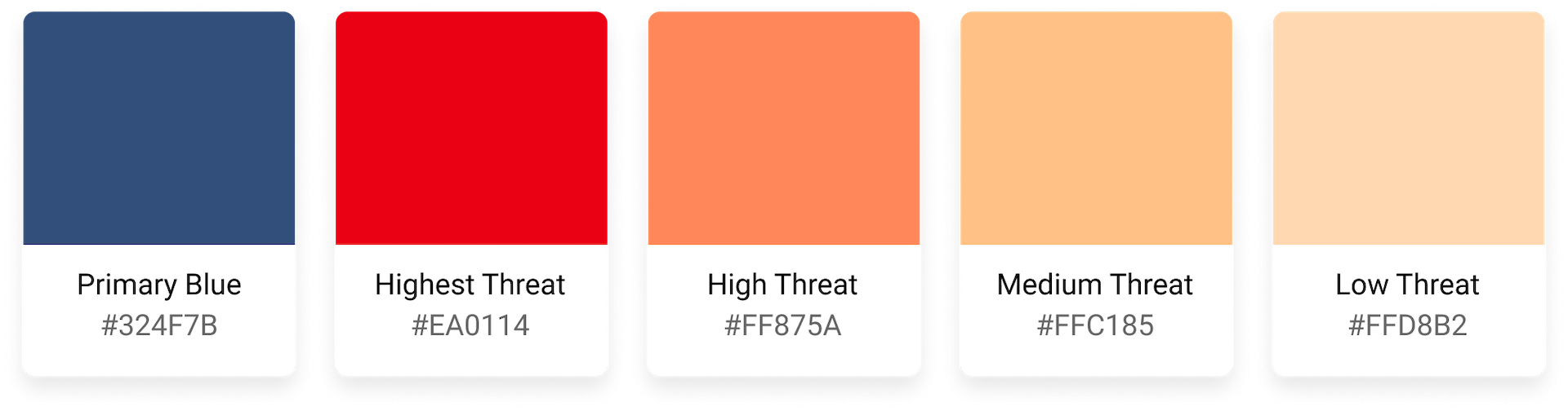
In the same tone as the product colors, the darker blue pairs nicely with the threat indication red and oranges while avoiding a Christmas vibe.
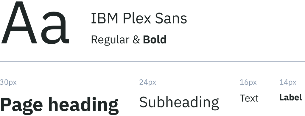
Typeface
I experimented with Heebo, Open Sans, and PT Sans before landing on IBM Plex Sans.
As soon as I saw it, I knew it was the obvious choice for Project Canopy’s typeface. It’s clean and professional while still approachable. It conveys the seriousness of the information without being intimidating.
Branding
The inspiration behind Project Canopy’s logo was “a tree, but pixelated.” Working with the logo and branding provided by the client, I updated the colors and adjusted the layout to be more versatile.
Final designs
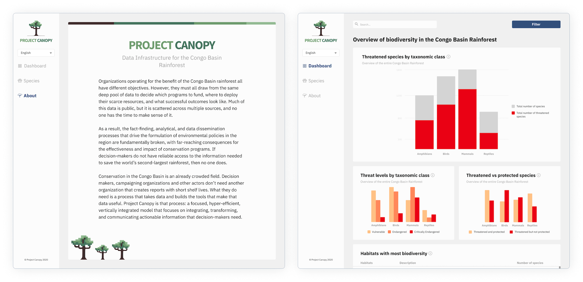
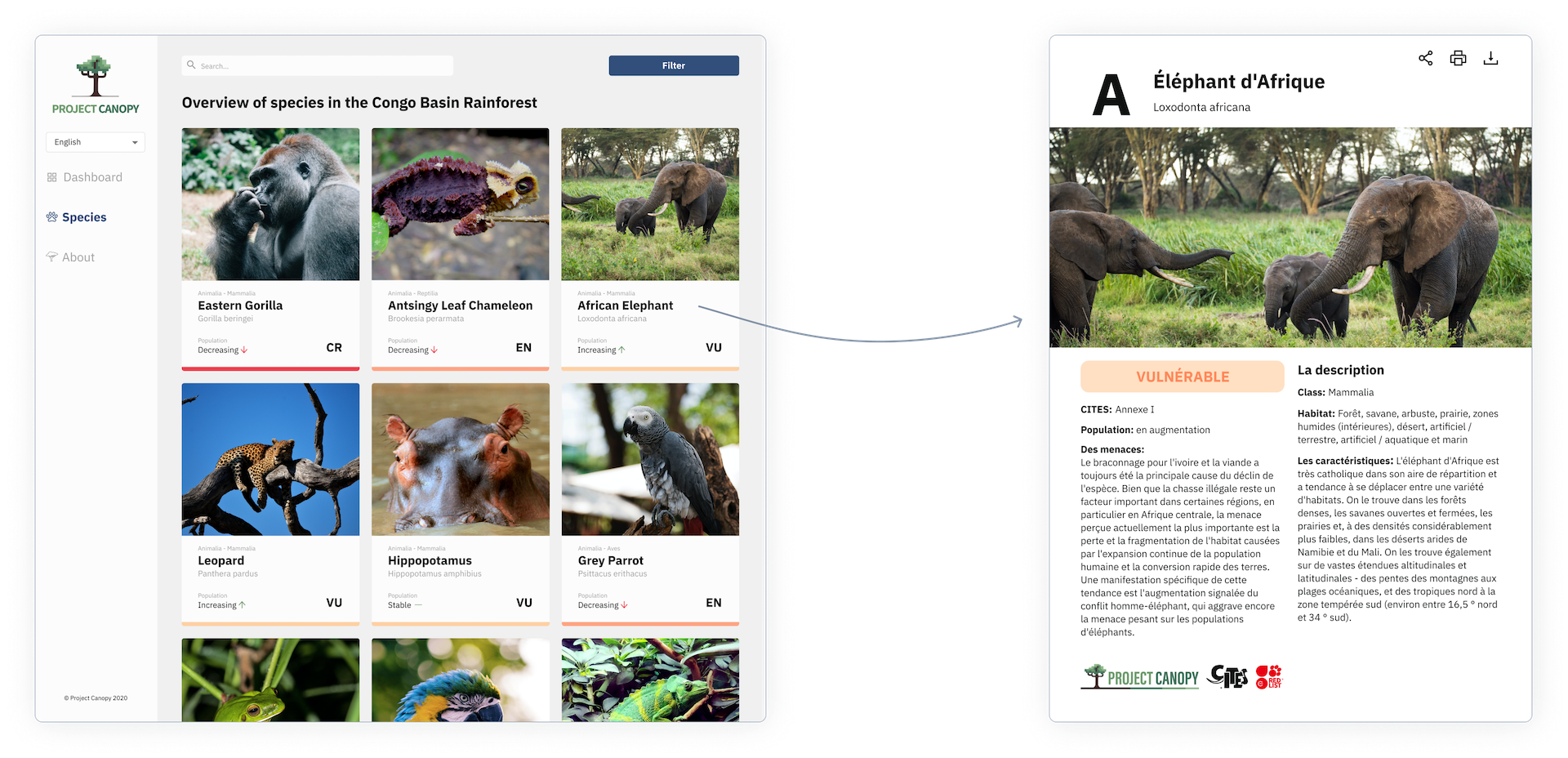
A large portion of Project Canopy’s userbase speaks French, so I created all key screens in French and English.
Key takeaways
At the beginning of this project, I knew very little about biodiversity in the Congo Basin rainforest or about displaying data, but I was (and still am) thrilled to have the opportunity to work on something so meaningful and important. I read countless articles, asked a constant stream of questions, and did what felt like 7 million iterations. At the end of 8 weeks, I had not only existed far outside of my comfort zone, but I also helped build something of which I am immensely proud. These are some of the things I learned along the way:
Data visualization is hard!
- The desire to design complicated, visually interesting charts and graphs is so strong, but as with many things, less is often more
- Just because every dashboard on Dribbble is fancy, doesn’t mean that fancy is best
- Tables are underrated. Especially when displaying text-heavy data
- When all else fails, remember to KISS (Keep It Simple, Stupid) Being your own team is more challenging than expected
- Having the ability to brainstorm and work with another designer makes everything easier and more enjoyable
English is a very condensed language
- When designing for a multi-lingual platform, make sure you allow extra room for text