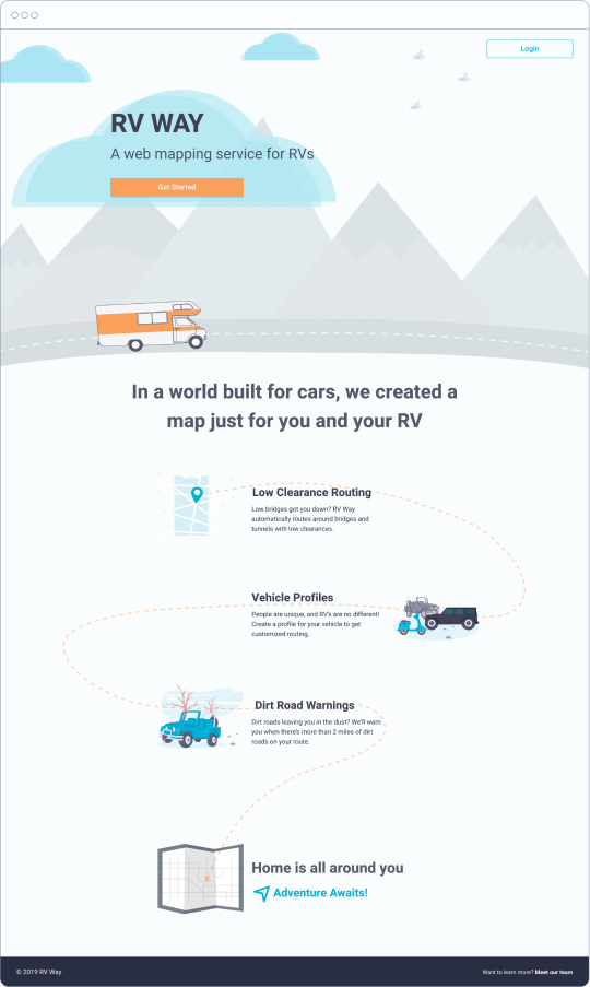
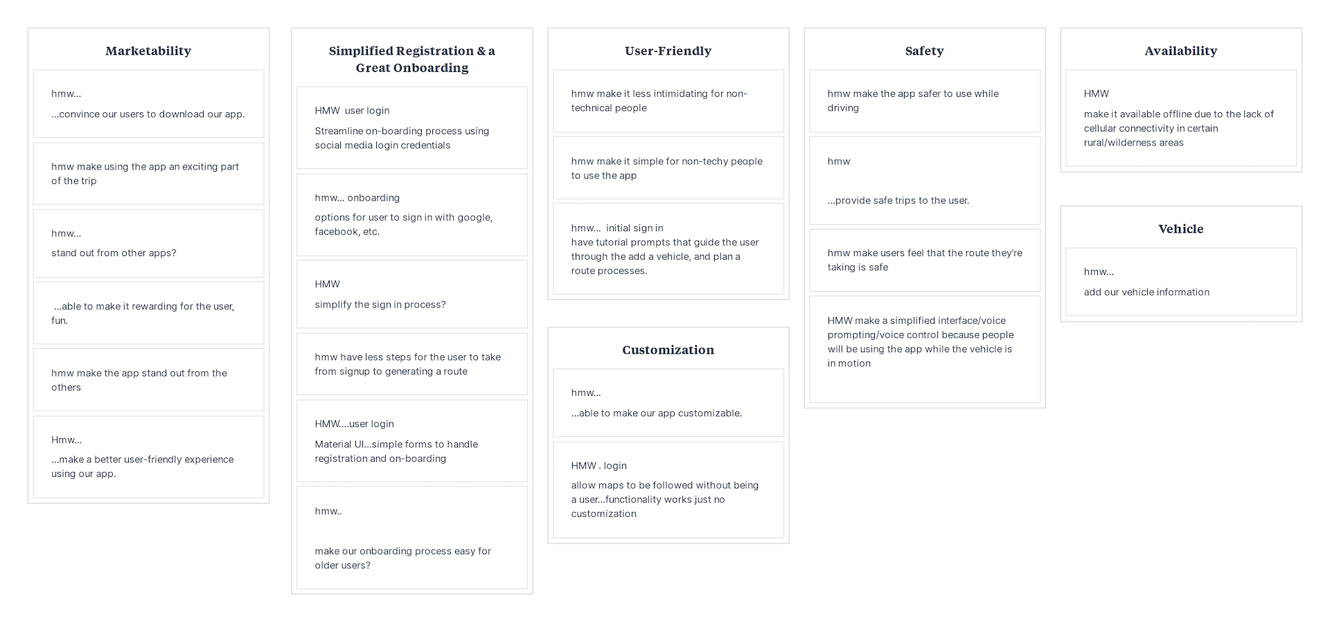
Home is all around you
Redesigning RV Way
Overview
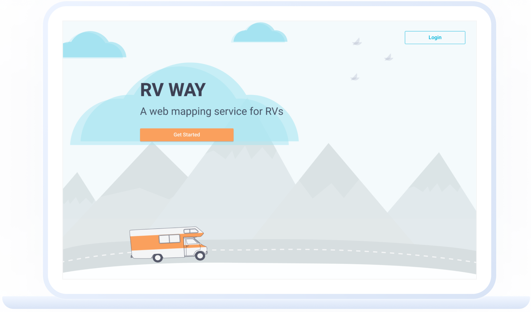
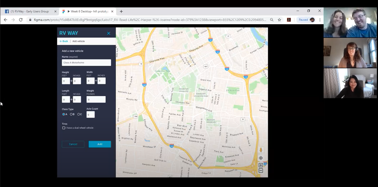
RV Way is a route planning web app designed specifically for people who travel in RV’s. Allowing users to input their vehicle’s specifications,
RV Way generates a route that guides them safely to their destination.
My team made the app more intuitive by designing a clean and simple look that appealed to our older demographic. We used conversational language and avoided jargon since our users might not be tech-savvy.
Role
- UX/UI
- Researcher
- Interviewer
- Prototyper
Team
- 2 UX Designer
- 3 Data Scientists
- 5 Developers
Timeline
8 weeks
Starting Location
Recreational vehicles (RVs for short), represent adventure, the open road,
and independence. The use of social media, the Tiny House Movement, and #VanLife have
brought mobile-living into the public eye. And as the cost of living
climbs higher and higher, the ability to take your home with you is becoming increasingly more
attractive.
At the beginning of the project, I knew next to nothing about the RV world. My knowledge was limited to passing them on the highway and what I’d seen in movies (raise your hand if you remember RV with Robin Williams).
I never would have guessed the depth of which the RV community cares for each other, or how thoughtful they are of the world around them.
During my interviews with RVers (both full-time and part-time)
the most consistent descriptor I heard was “tribe.” RVers rely on each other for important information
(one woman we interviewed will actually get in her car and drive around a new area with a tape measure to make sure bridges are actually the height the sign claims).
They are a family, a community, a tribe. They care for one another, whether they’ve met in person or not.
RV travelers in the U.S.
- 25 million people a year
- 10 million full time RVers
The typical RVer
- Married and 48 years old
- Annual income of $68,000
Trends in RV ownership*
- 2.32% increase in ages 35-44
- 3.07% increase in ages 25-34
Getting Directions
My team was tasked with improving the usability of the product, then named RV Nav. We began this process by reviewing the previous team’s documentation, getting to know the users, and conducting usability testing to see what worked, and what didn’t.
It became clear early on that we would have to totally redesign the user interface (UI), as testing showed it was not clear what the app was for, or how to navigate it.
Overhauling a product’s entire UI in 8 weeks or less is no small feat. Knowing that improvement is a never-ending process and to keep ourselves on track, we focused on the following goals:
- Provide the most efficient and safe route for users who drive their RV's around
- Give users the most accurate intel based on their details and preferences
- Continuously improve the routing function through additional data sources and crowd-sourced data
- Provide users with a simple and beautiful app design to yield a better RV traveling experiences
My partner and I wanted to engage our entire team in our process early on. This not only helped build camaraderie, but it also helped our developers and data scientists understand what we, as UX designers, were contributing to the team. They were so excited when we asked them to join us for a brainstorming workshop!
During this workshop, we worked as a team to create initial survey questions, and asked how might we achieve our goals?
We had the absolute pleasure of interviewing a wide range of people
throughout this entire process.
They shared stories of life on the road (both full-time and part-time), what it’s like to raise a family in 400sqft (or less), maneuverability successes, scariest moments, hilarious anecdotes, and so much more.
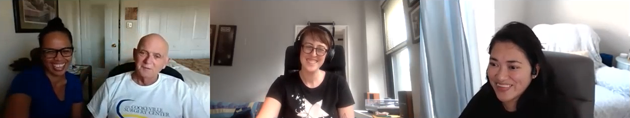
Chatting with D & M was a blast. My face hurt from laughing so much!
While a wealth of invaluable information was shared with us during our interviews, one of my favorite anecdotes was the term Stick-and-Bricker: referring to someone who lives in a stationary home.
The whole RV experience is extremely personal, and the majority of RVers rely on each other for important tips and safety information via message boards and Facebook groups.
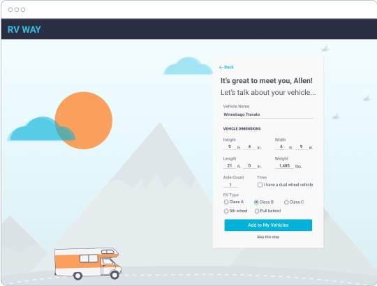
During our initial interviews, we learned that many of our users preferred products that had a personal touch. They didn’t want to feel like they were interacting with a robot, but with a fellow RVer (or at least a humanoid robot!). Taking the community mindset into account, we designed an onboarding experience to feel conversational and personalized.
Road Blocks
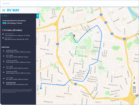
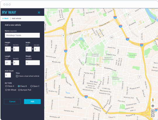
In the existing app, users input their vehicle’s specifications, then a route was generated that’s safe for RVs. But early testing showed that the user interface was not intuitive. It wasn’t clear what the user is supposed to do first when they arrived on the map page.
Navigating the app was confusing and overall, the existing solution was just not usable.
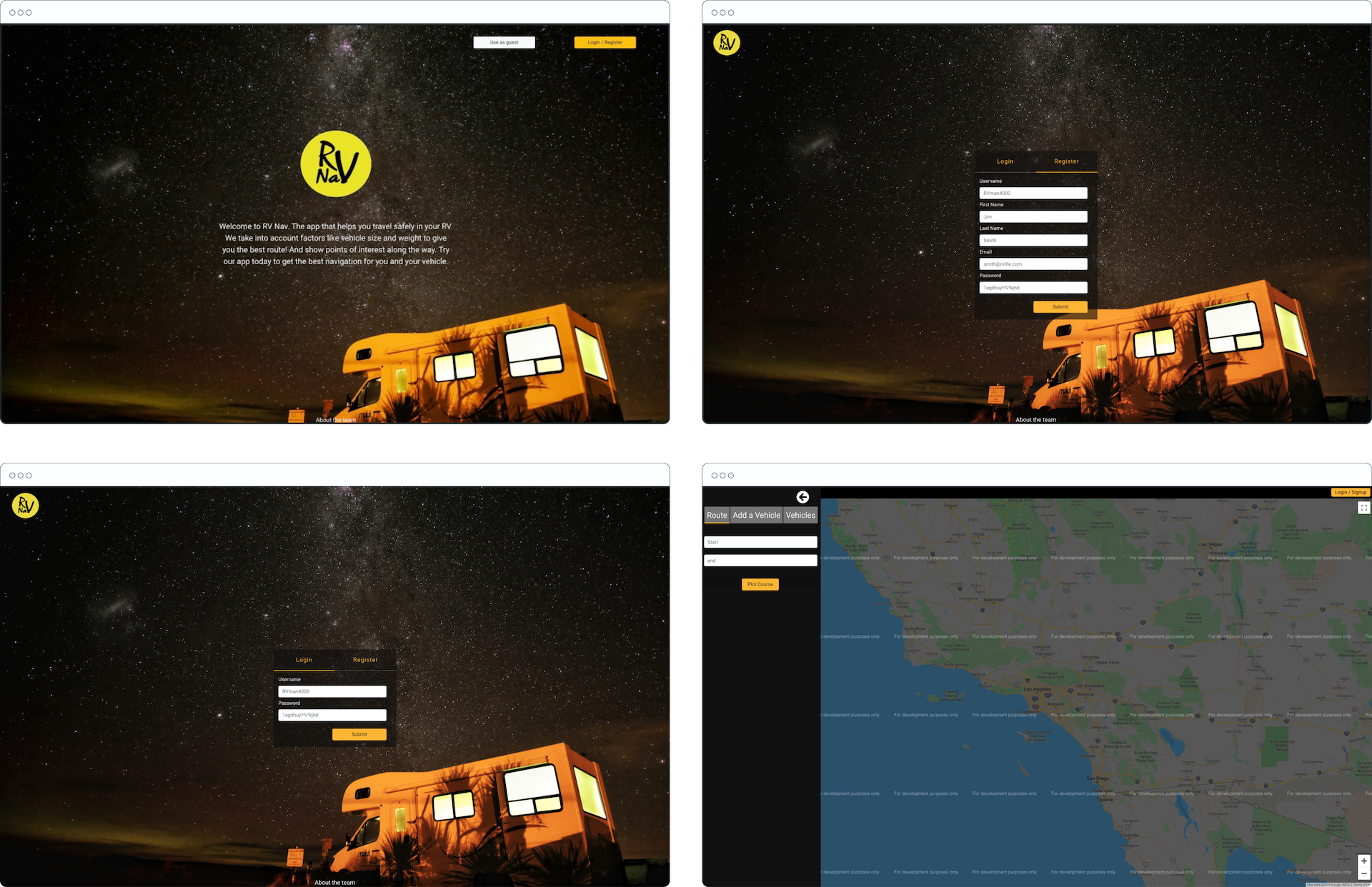
The original design didn’t meet accessibility standards and the home page was not informative. An overwhelming majority of people we interviewed weren’t sure what the purpose of RV Nav was, or how it was different from other navigational products.
“Right of the bat, the front page tells me nothing. There aren’t pictures to suggest anything and the big block of text is too hard to read.”
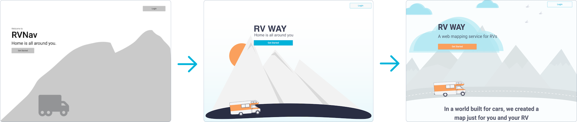
We began with the name: our
testing showed that the name RV Nav wasn’t descriptive enough.
Nav (an abbreviation on navigation) is a recent adaptation. A large percentage of our demographic is older, so we wanted to choose a name that was clear to a broader range of people.
We experimented with many names related to RVs and life on the road, and after conducting preference and association research, we landed on RV Way. It tested well with a wide age range and represents the message we heard over and over again: RVing isn’t just a hobby, it’s a way of life.
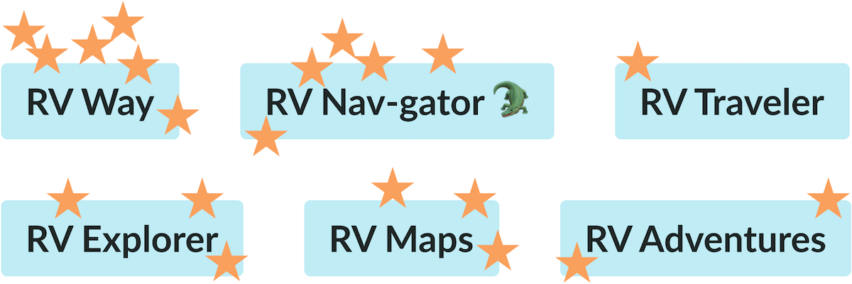
As you can see, we had several Dad Joke lovers on our team (myself included)
Knowing we needed to overhaul the current UI and only had 8 weeks to do so, we borrowed a few techniques from Jake Knapp’s Design Sprint. Taking to our respective whiteboards, we sketched out as many layouts ideas as possible in 15 minutes or less.
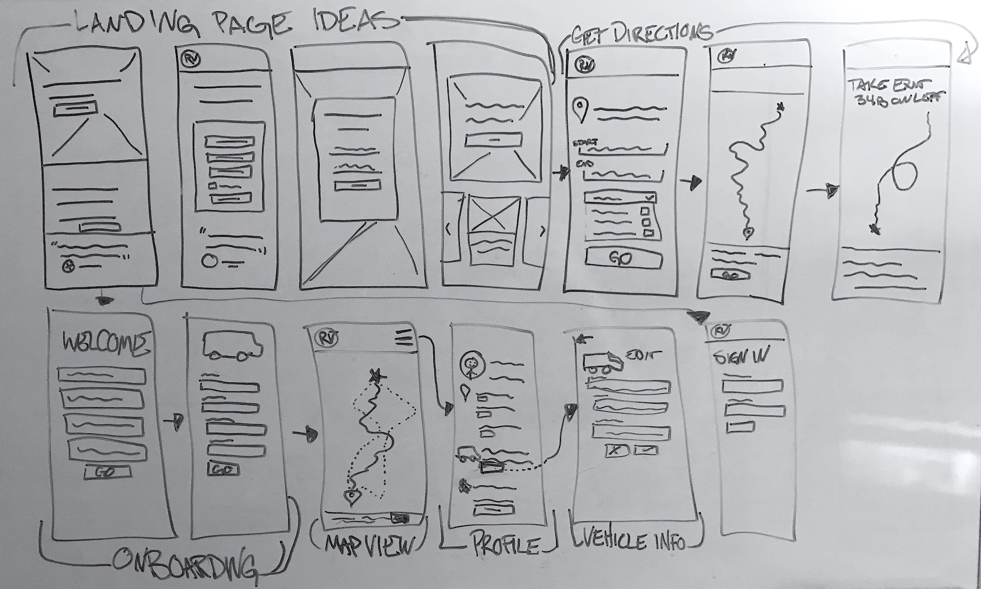
“How do I get safely from point A to point B with my RV?”
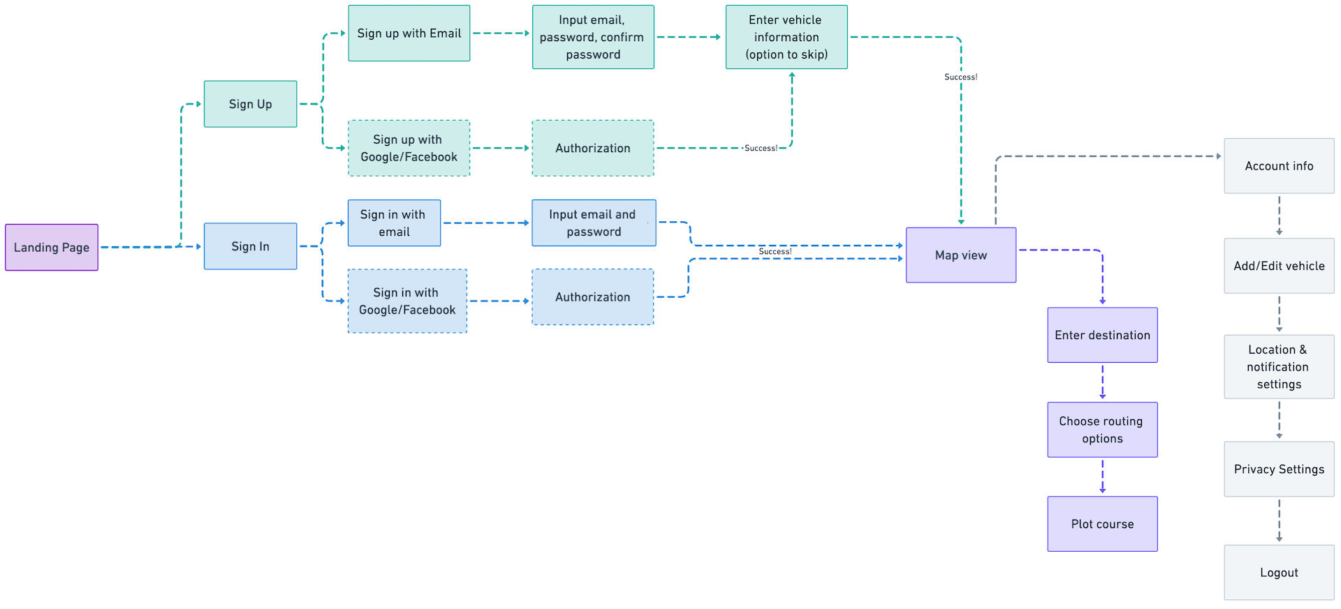
Understanding the steps our users will take to reach their destination is just as important in UX as it is when planning a road trip.
Just like many road trips, our user flow took a rather circuitous route to reach its final form. And as RVers know perhaps better than anyone,
once we understood our route, it was all about the journey from then on.
Alternative Routes
Working on this project drove home the mindset of “you are not your users,” because design, like road trips, doesn’t always go according to plan. Sometimes you have to choose an alternative route, and finding the best option is often an iterative process.
Initially, we relied on assumptions loosely backed by research for all of our design decision. By conducting usability tests and getting feedback from peers we were able to make iterations based not only on what we thought would work but what our users actually needed.
We found that our initial design for the home page was too vague and created
a false bottom
I think of this as “the curse of the Dribbble shot mindset”). Users didn’t know to scroll down for more information.
We updated the background illustrations to be more visually interesting without causing a distraction and updated the copy to be descriptive.
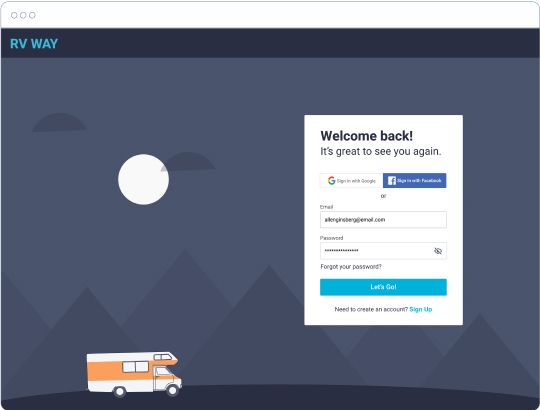
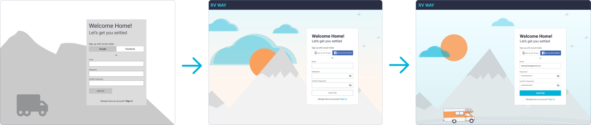
We received feedback that the sign-up background was too chaotic, so we adjusted the colors to make the sign-up form pop.
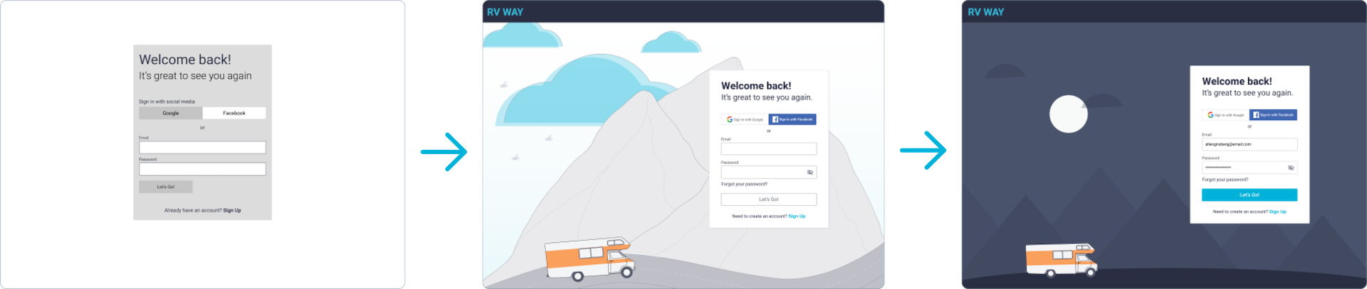
Feedback about the sign-up page was unanimous: while the mountain illustration was cool, it didn’t convey the same feeling as the two-dimensional mountains used everywhere else in the design. Taking this feedback into account, we changed the sign-in page to be visually similar to the rest of the app. To help distinguish it from the sign-up page, we went with a nighttime color scheme.
Design System
We took an afternoon to gather inspiration, dive into colors, and explore typefaces. We asked ourselves, “What feeling are we trying to convey? What colors help convey those feelings?”
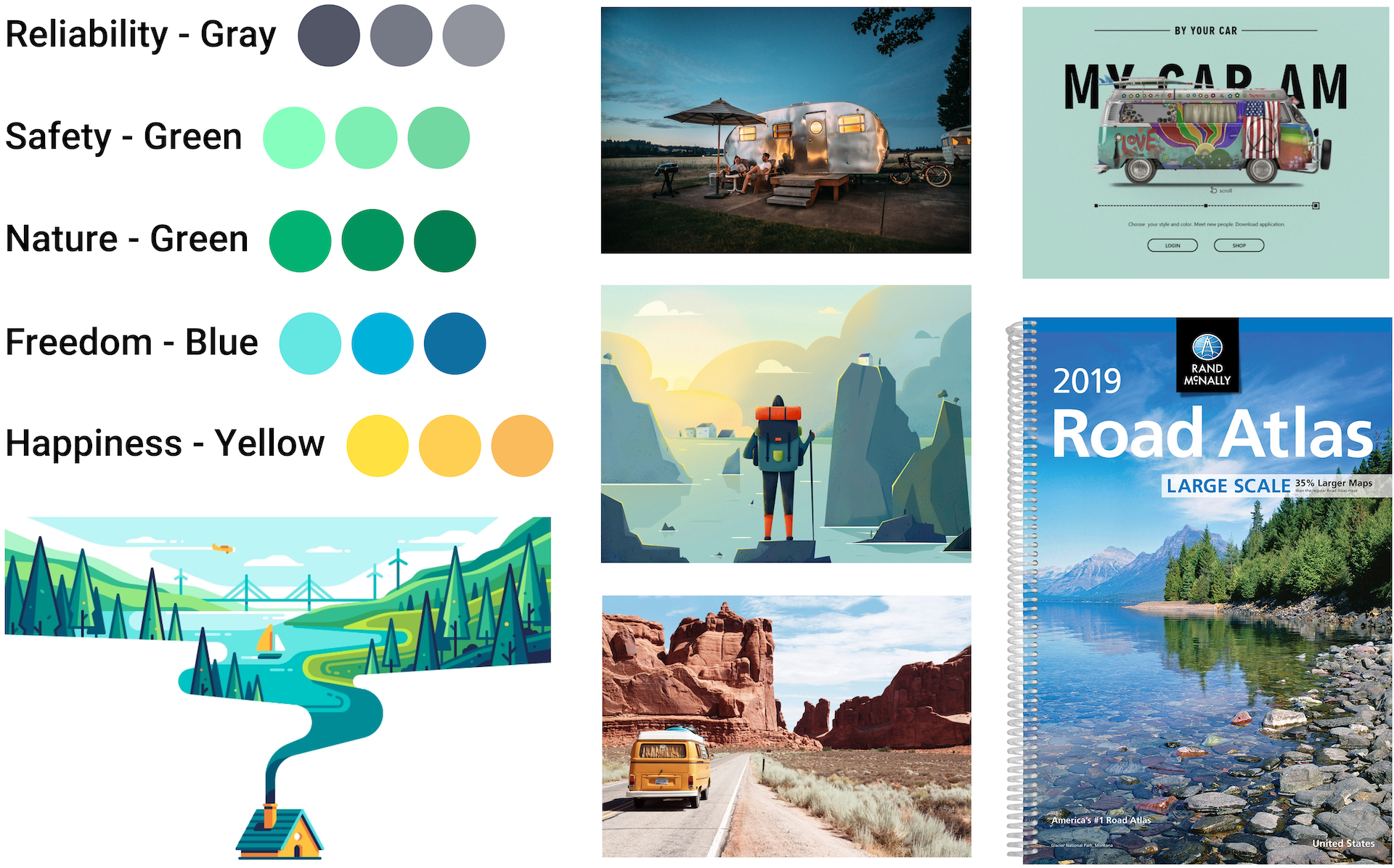
Color Palette
Avoiding the urge to use every color under the sun, we kept things simple by choosing one primary color and one accent.
They represent freedom, adventure, friendliness, reliability, safety, and joy.
Using opacity helped keep our color palette minimal while still providing visual variation.
Typeface
We wanted a font that was easy to read, felt safe, and had a hint of adventure. We tried Helvetica, Roboto, Lato, and Heebo.
We went to our peers for input on fonts, and everyone agreed that Heebo was the best of the bunch. It’s legible, has some personality, but still conveys safety.
Branding
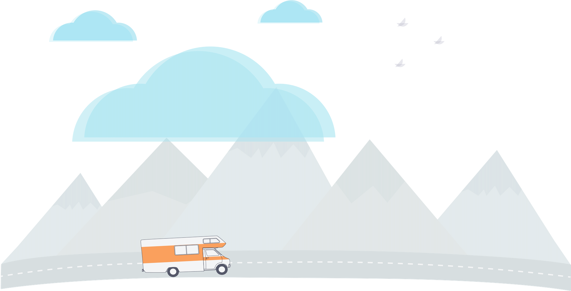
There’s a fair amount of whimsy and a whole lot of adventure in the RV world. We decided that illustrations were the best way to carry that whimsy off of the streets and into our designs.
I put on my illustrator hat and got to work doodling RVs and mountains. And thus our tiny orange RV was born! I’d be lying if I said there was no squealing once it was finished. It’s just so cute!
Looking in the Rearview Mirror
“The drive is not always about the destination. The sights in between are just as interesting. There’s lots of help finding where to go, but not the best way to get there in an RV”
This quote from one of our interviewees really stuck with me. Traveling in an RV, like life, (and UX!) is not necessarily about the destination.
The journey is just as valuable, and the fastest route is not always the best option.
There’s something to be said for choosing the road less traveled. You never know what adventures you’ll find along the way!
Waiting too long for feedback is wasteful
It’s of utmost importance to get feedback early and often. Not just from users, but from developers and other team members. We could have saved so many headaches had we taken more time to learn about our dev team’s capabilities.
You are not your users
Just because something makes sense to you and your peers, doesn’t mean it will make sense to your users! If we rely on our assumptions without validation from users, we might end up with a product that users are not going to love or worse, not use at all.
Users will always have a different perspective on what is and what is not useful.
“Sometimes you have to yeet your babies.”
A mentor once gave me this invaluable advice:
like most things in life, the first solution is not always the best solution.
Iteration is key, and there’s always room for improvement. This project provided ample opportunities for me to “yeet my babies.”
I learned not to get too attached to any of my designs, to be flexible, and open to feedback in all forms.